# Radio
Radio buttons. The "you can only have one" variation of checkboxes. Create some options and let your users select one and only one. May they choose wisely.
## Overview
The radio fieldtype is a multiple choice input where you only get one choice. It saves the chosen option from a preset list.
## Configuring
Use the `options` setting to define a list of values and labels.
``` yaml
favorite:
type: radio
instructions: Choose your favorite food.
options:
donuts: Donuts
icecream: Ice Cream
brownies: Brownies
```
You may omit the labels and just specify keys. If you use this syntax, the value and label will be identical.
``` yaml
options:
- Donuts
- Ice Cream
- Brownies
```
### Appearance
Use the `appearance` setting to change how options are rendered in the Control Panel:
``` yaml
favorite:
type: radio
appearance: chips
options:
donuts: Donuts
icecream: Ice Cream
brownies: Brownies
```
| Value | Description |
|-------|-------------|
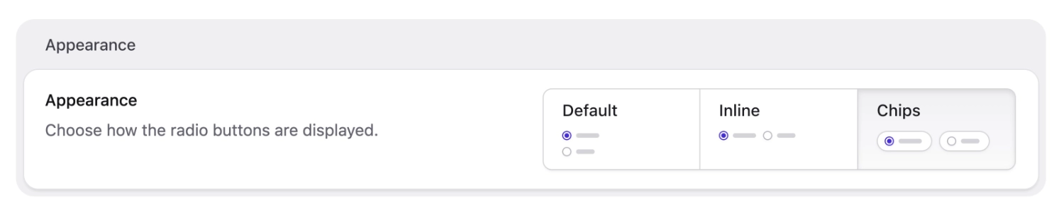
| `default` | Standard radio buttons, stacked vertically. |
| `inline` | Radio buttons in a horizontal row. |
| `chips` | Pill-style buttons with larger touch targets. |
:::tip
`inline: true` still works on publish forms, but when you edit and save the field in the blueprint editor, Statamic converts it to `appearance: inline`.
:::
#### Chips
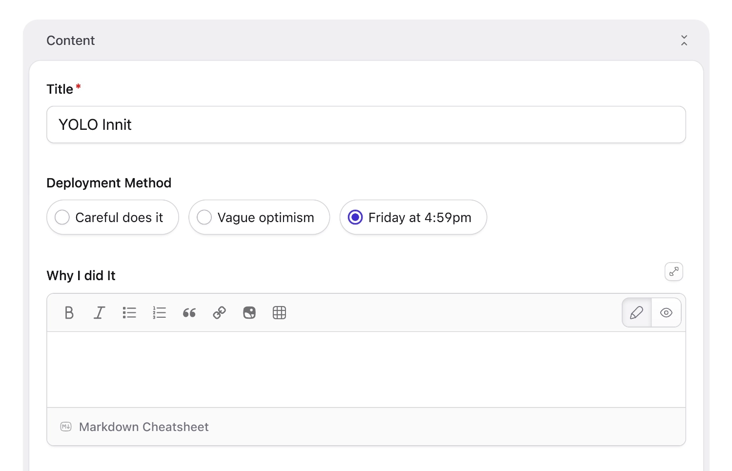
The chips appearance option is new in Statamic v6.22. Chips are inline pill-style buttons with larger touch targets. You can select them in the control panel under the appearance setting or configure them in the blueprint YAML, as shown above.
Chips are available for both radio and [checkbox](/fieldtypes/checkboxes.md) fieldtypes.
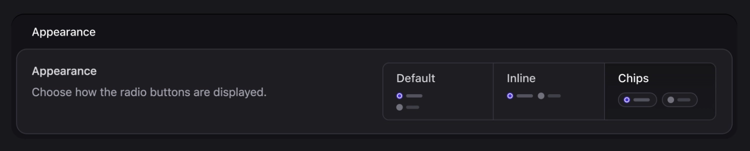
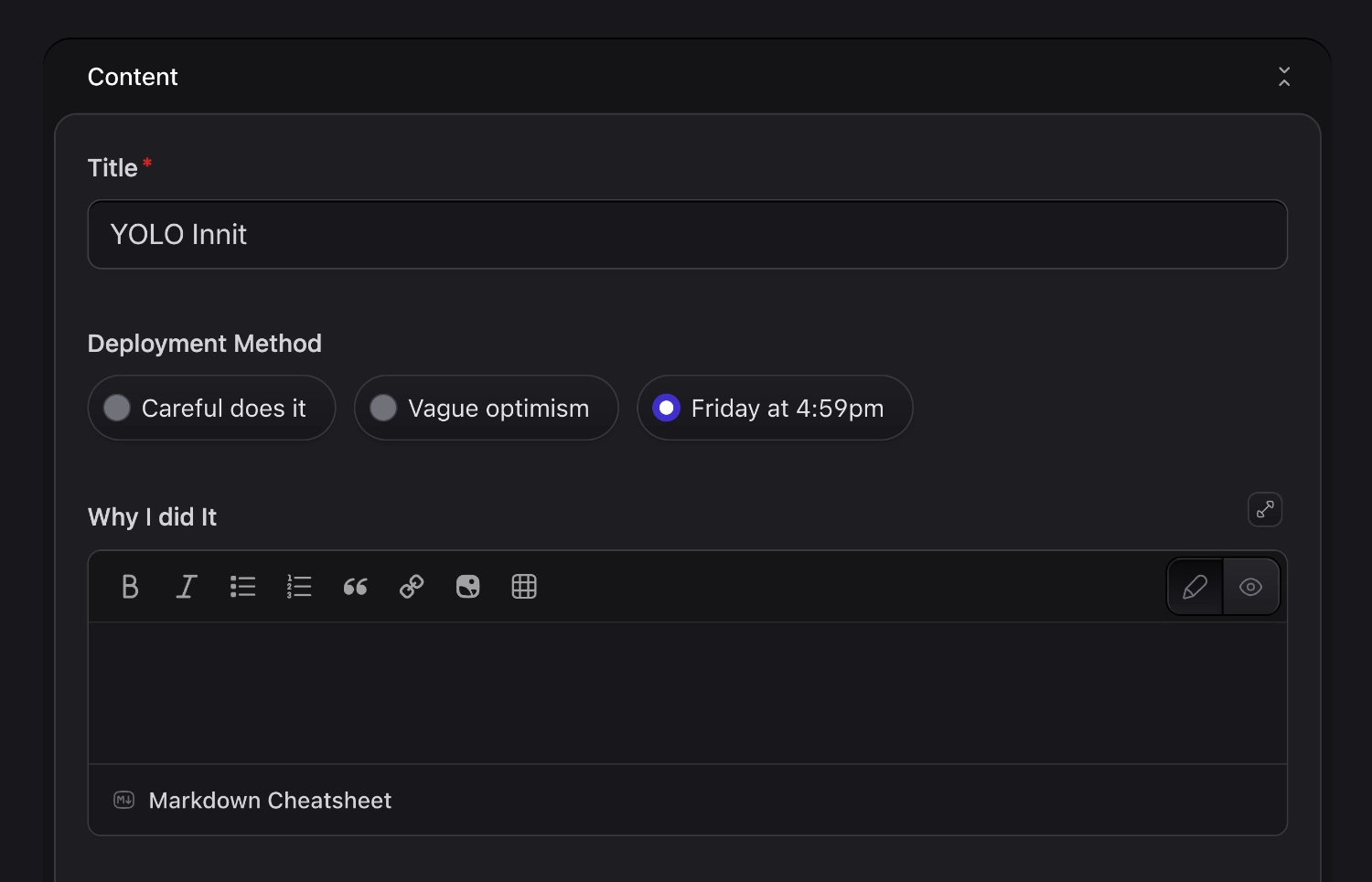
Appearance options for the radio fieldtype, including chips.And here's what it looks like on a publish form.
### Options in blueprint YAML
See [Select · Options in blueprint YAML](/fieldtypes/select.md#options-in-blueprint-yaml)—checklists defined in the blueprint use the same expanded `key` / `value` option rows for ordered, storage-agnostic option lists.
## Data Structure
The chosen option is stored as a string. If you only specified values for the `options` array, then the label will be saved.
``` yaml
favorite: brownies
```
## Templating
It's a string, so you can just use that value.
::tabs
::tab antlers
```antlers