Info Fieldtype
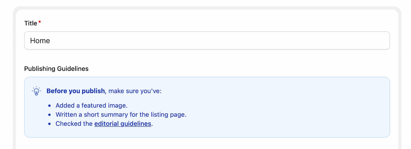
The Info fieldtype displays a styled message in your Control Panel publish forms. Use it to give authors a helpful tip, highlight important instructions, or warn them about something before they hit save.
Overview#
When a field's instructions need a little more attention, add an Info field to your blueprint. Its content is configured in the blueprint, so authors see your message while editing without being able to change it.
This fieldtype is presentation-only: it displays in the Control Panel and stores no data.
For full control over the markup and more custom content, use the HTML fieldtype.
-
  handle: publishing_tip
  field:
    type: info
    content: |
      **Before you publish**, make sure you've:

      - Added a featured image.
      - Written a short summary for the listing page.
      - Checked the [editorial guidelines](https://example.com/editorial-guidelines).
    state: tip
    alert_icon: lightbulb-idea
Markdown is sanitized before being displayed, and links open in a new tab.
States#
Choose a state to match the importance of your message. Each state has its own color and default icon.
| State | Label | Color |
|---|---|---|
notice |
Notice (default) | Gray |
tip |
Tip | Blue |
warning |
Warning | Yellow |
important |
Important Warning | Red |
success |
Success | Green |
You can override the default icon using the Icon picker in the field's configuration, or by setting alert_icon in YAML.
Conditional Display#
You can use conditional field rules to show an Info field only when it's relevant. For example, display a reminder when a summary field is empty:
-
  handle: summary_reminder
  field:
    type: info
    content: 'Add a short summary for the listing page before publishing.'
    state: warning
    if:
      summary: empty
The reminder disappears once the author fills in the summary. How neat is that?
Options
content
The information to display. Supports Markdown, including links and lists.
state
The visual style of the message. Choose from notice, tip, warning, important, or success. Default: notice.
alert_icon
Choose an icon from Statamic's built-in icons. Leave empty to use the state's default icon.