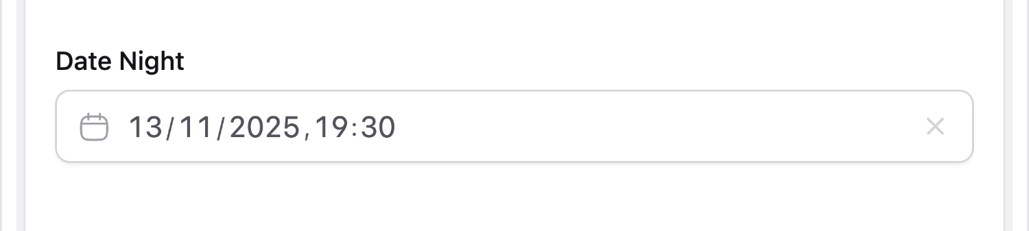
Date Fieldtype
Work with dates, times, and ranges with a variety of user interface options that make you really enjoy basically just picking numbers from a table.
Overview#
Date fields have highly configurable user interfaces. They can be as simple as a single date and/or time, or as fancy as a multi-month calendar with multi-day range picking. Be sure to experiment with the various config options to create the best experience for your content authors.
Data Structure#
Single dates are stored as a date/timestring. Ranges are stored as an array with a start and end key.
date: 1983-10-01 12:00:00
date_range:
  start: 2019-11-18 00:00
  end: 2019-11-22 00:00
Dates are stored in your application's timezone.
The time will be when time_enabled is true, or depending on the timezone of the user who selected the date. e.g. On date fields where there is no time configured, it will assume midnight for the person who selected it.
Templating#
Date fields are augmented to return a Carbon instance. When used as a string they will return a pre-formatting output that uses your config.date format setting. By default that'll look like January 1, 2020.
Date Ranges#
Ranges have nested start and end variables, so you can access them like this:
// Nested variable
Event: {{ date:start }} through {{ date:end }}

// Tag pair
{{ date }}
Event: {{ start }} through {{ end }}
{{ /date }}
Event: {{ $date_range['start'] }} through {{ $date_range['end'] }}
Formatting Dates#
You can format the output of your date fields with the format modifier and PHP's date formatting options.
{{ date format="Y" }} // 2019
{{ date format="Y-m-d" }} // 2019-10-10
{{ date format="l, F jS" }} // Sunday, January 21st
When using Blade, you may also call the ->format method on Carbon instances.
{{-- Using Modifiers --}}
{{ Statamic::modify($date)->format('Y') }} // 2019
{{ Statamic::modify($date)->format('Y-m-d') }} // 2019-10-10
{{ Statamic::modify($date)->format('l, F jS') }} // Sunday, January 21st

{{-- Using Carbon methods --}}
{{ $date->format('Y') }} // 2019
{{ $date->format('Y-m-d') }} // 2019-10-10
{{ $date->format('l, F jS') }} // Sunday, January 21st
Formatting localized Dates#
You can format localized dates with the iso modifier and ISO formatting options. This use Carbon's inner translations rather than language packages you need to install on every machine where you deploy your application.
{{ date iso_format="YYYY" }} // 2019
{{ date iso_format="YYYY-MM-DD" }} // 2019-10-10
{{ date iso_format="dddd, MMMM Do" }} // Sunday, January 21st
When using Blade, you may also call the ->isoFormat method on Carbon instances.
{{-- Using Modifiers --}}
{{ Statamic::modify($date)->isoFormat('YYYY') }} // 2019
{{ Statamic::modify($date)->isoFormat('YYYY-MM-DD') }} // 2019-10-10
{{ Statamic::modify($date)->isoFormat('dddd, MMMM Do') }} // Sunday, January 21st

{{-- Using Carbon methods --}}
{{ $date->isoFormat('YYYY') }} // 2019
{{ $date->isoFormat('YYYY-MM-DD') }} // 2019-10-10
{{ $date->isoFormat('dddd, MMMM Do') }} // Sunday, January 21st
Timezones#
Dates are stored in your application timezone, then converted before being displayed to users.
For more information on how Statamic handles timezones, please review our Timezones guide.
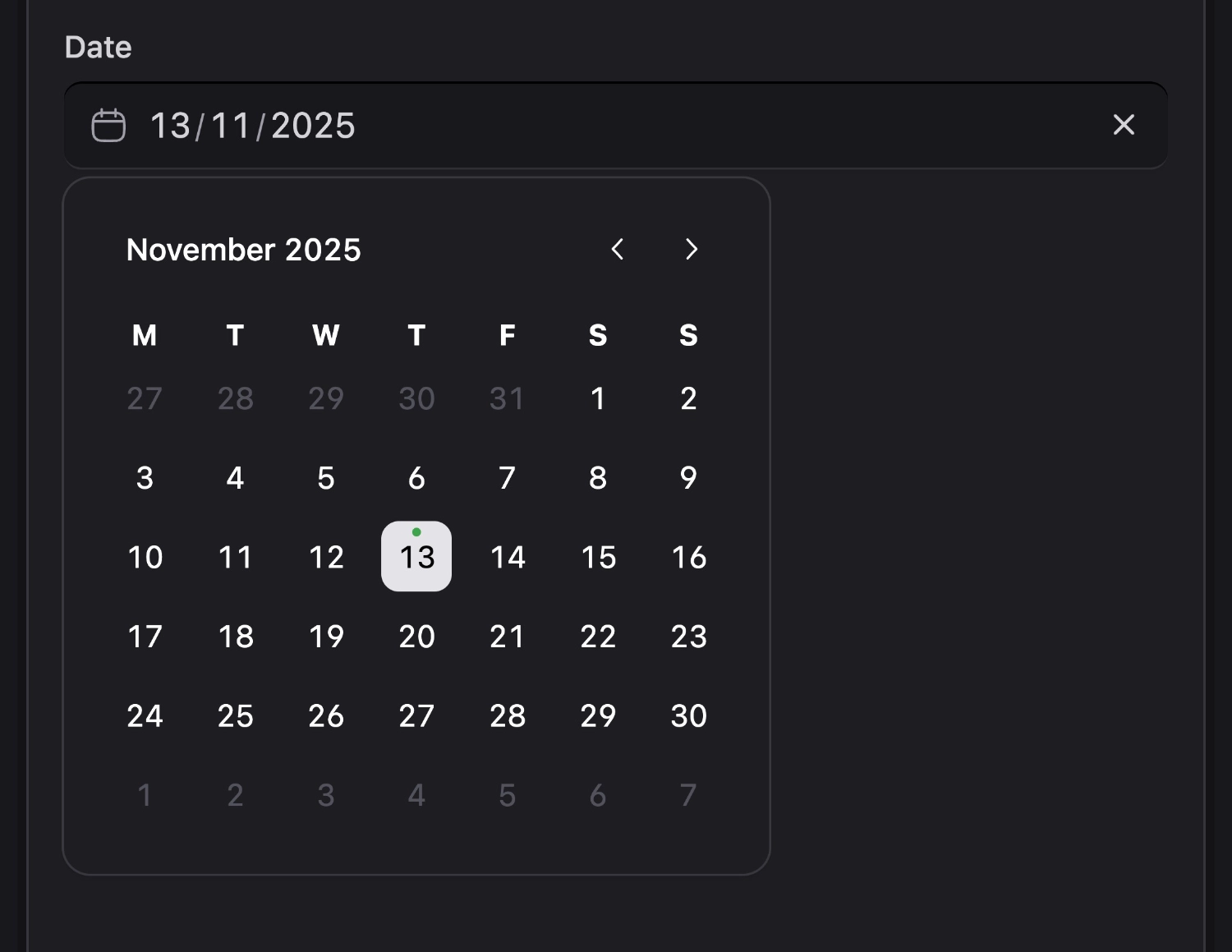
Control Panel Timezone#
By default, dates in the Control Panel are displayed and entered in the browser's local timezone. This means a user in New York and a user in London editing the same entry would each see the date in their own timezone.
If you'd prefer all users to see and enter dates in a specific timezone, you can configure it site-wide in config/statamic/cp.php:
'default_timezone' => env('STATAMIC_CP_DEFAULT_TIMEZONE', 'auto'),
Set this to any IANA timezone (e.g. America/New_York) to pin all date fields to that timezone. The default value of auto uses each user's browser timezone.
You can also override this on a per-field basis with the timezone field config option.
Options
columns
Show multiple months at one time, in columns and rows. Default: 1.
earliest_date
Set the earliest selectable date in YYYY-MM-DD format. Default: 1900-01-01.
format
How the date should be stored, using the PHP date format. We recommend choosing a format which stores date & time.
full_width
Enable to stretch the calendar out like Stretch Armstrong, using the maximum amount of available horizontal space. Default: false.
inline
Always show the calendar instead of the text input and dropdown UI. Default: false.
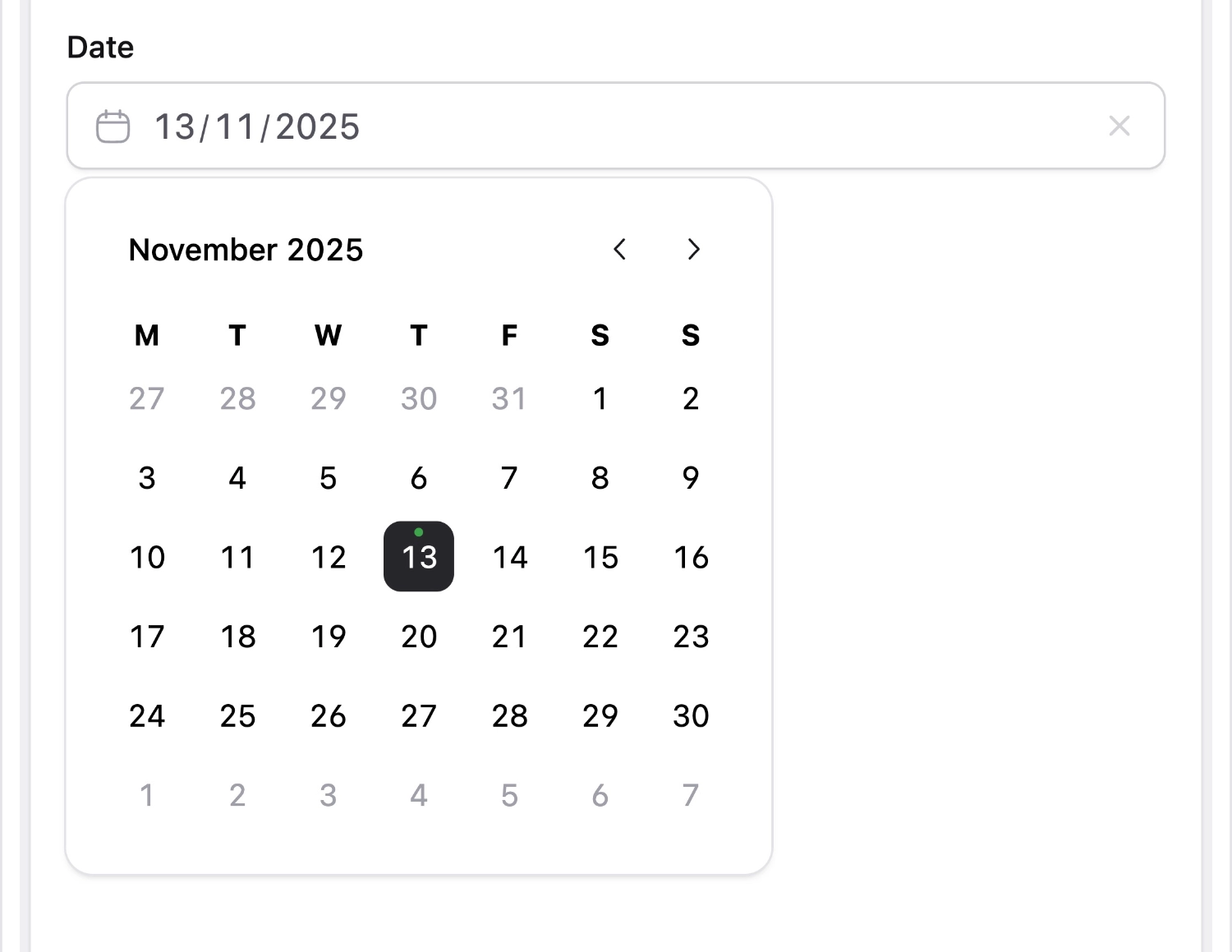
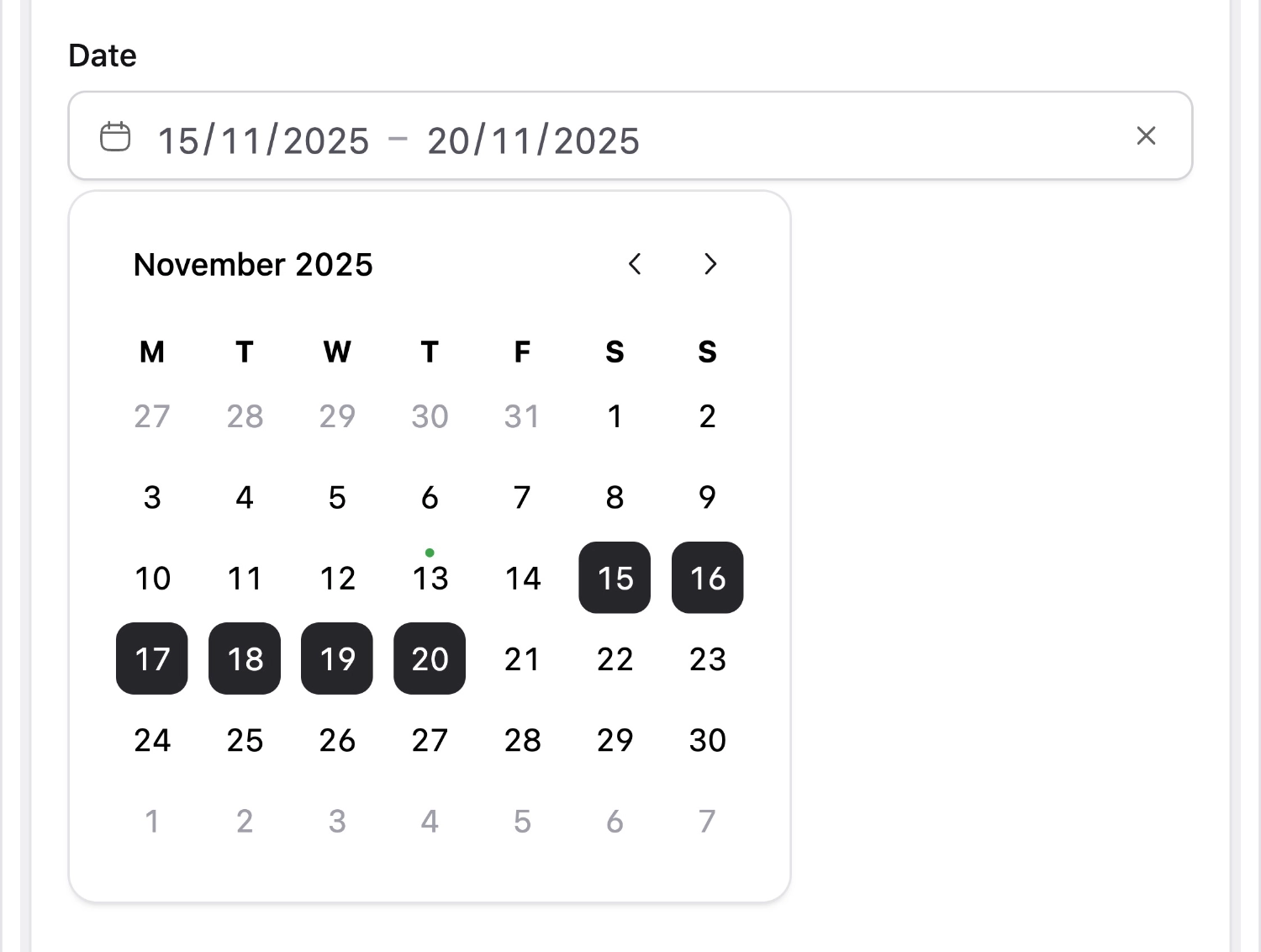
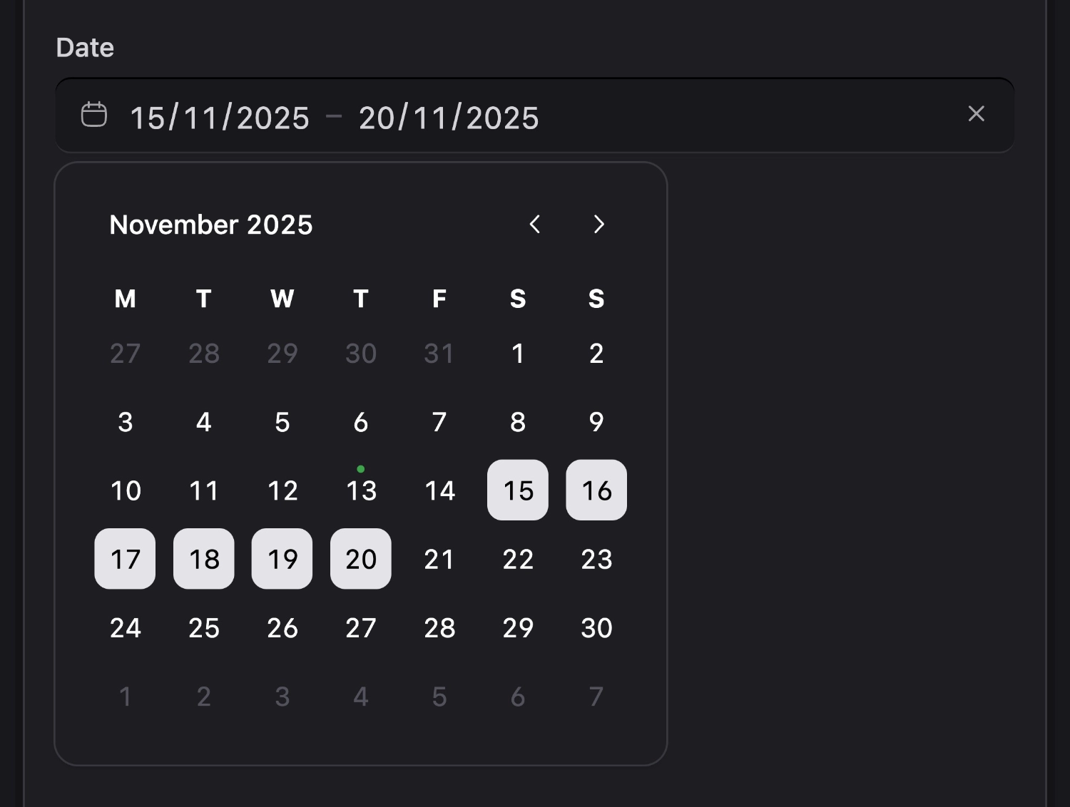
mode
Choose between single or range. Range mode disables the time picker. Default: single.
rows
Show multiple months at one time, in columns and rows. Default: 1.
time_enabled
Enable/disable the timepicker. Default: false.
time_required
Makes the time field visible and non-dismissible. Default: false.
timezone
The timezone dates will be displayed and entered in within the Control Panel. Accepts any IANA timezone (e.g. America/New_York). Defaults to the site-wide default_timezone configured in config/statamic/cp.php, which itself defaults to auto (the browser's local timezone).