Checkboxes Fieldtype
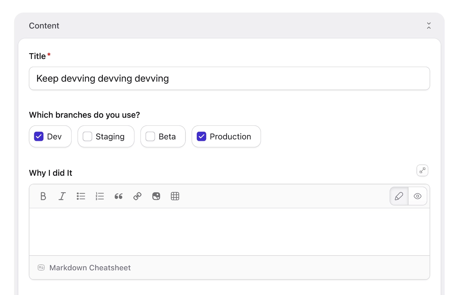
Checkboxes! Make some checkboxes, click the checkboxes, and store a record of which boxes of which ones you clicked. They're boxes you check.
Overview#
The checkboxes fieldtype is a multiple choice input. It saves one or more options chosen from a preset list. In other words, they're boxes you check.
Configuring#
Use the options setting to define a list of values and labels.
favorites:
  type: checkboxes
  instructions: Choose up to 3 favorite foods.
  options:
    donuts: Donuts
    icecream: Ice Cream
    brownies: Brownies
You may omit the labels and just specify keys. If you use this syntax, the value and label will be identical.
  options:
    - Donuts
    - Ice Cream
    - Brownies
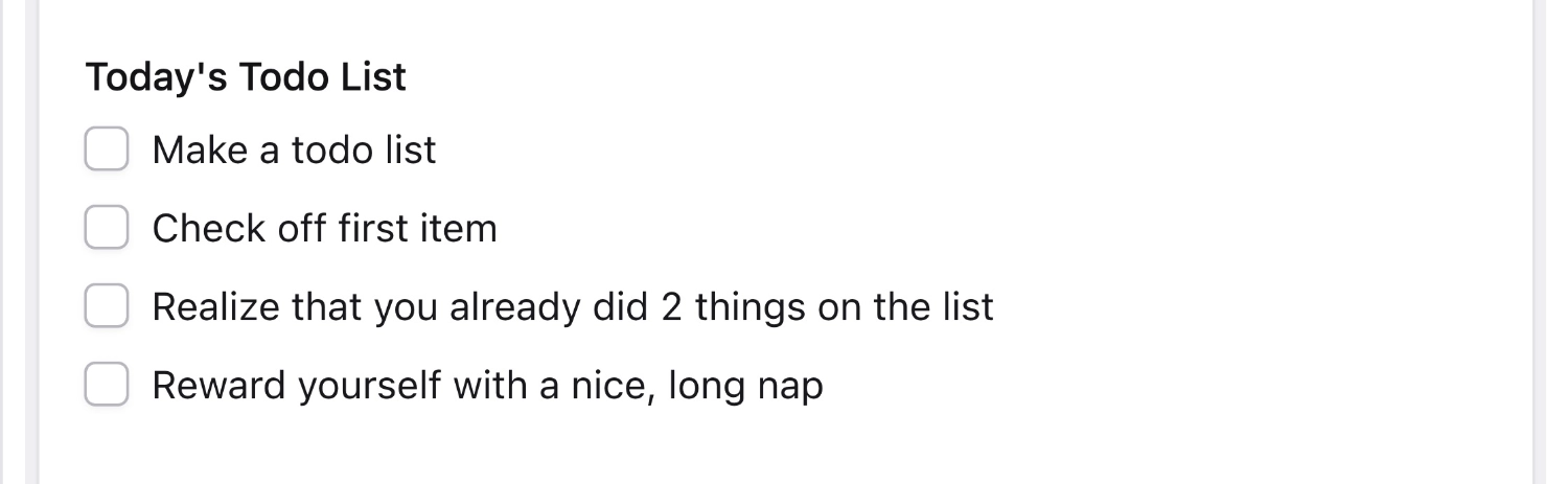
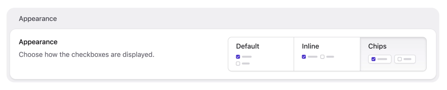
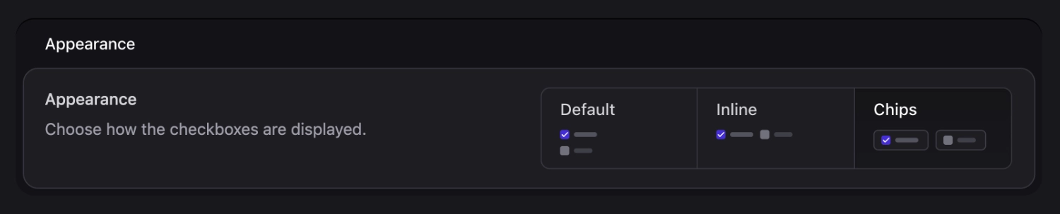
Appearance#
Use the appearance setting to change how options are rendered in the Control Panel:
favorites:
  type: checkboxes
  appearance: chips
  options:
    donuts: Donuts
    icecream: Ice Cream
    brownies: Brownies
| Value | Description |
|---|---|
default |
Standard checkboxes, stacked vertically. |
inline |
Checkboxes in a horizontal row. |
chips |
Pill-style buttons with larger touch targets. |
inline: true still works on publish forms, but when you edit and save the field in the blueprint editor, Statamic converts it to appearance: inline.

Chips#
The chips appearance option is new in Statamic v6.22. Chips are inline pill-style buttons with larger touch targets. You can select them in the control panel under the appearance setting or configure them in the blueprint YAML, as shown above.
Chips are available for both checkboxes and radio fieldtypes.
Options in blueprint YAML#
See Select · Options in blueprint YAML—checkbox options in the blueprint use the same expanded key / value rows so order is preserved everywhere.
Data Structure#
The values are stored as a YAML array. If you only specified values for the options array, then the labels will be saved.
favorites:
  - donuts
  - icecream
Templating#
You can loop through the checked items and access the value and label of each item inside the loop.
<ul>
{{ favorites }}
    <li>{{ value }}</li>
{{ /favorites }}
</ul>
<ul>
	@foreach($favorites as $favorite)
	{{-- You can also access $favorite['key'] and $favorite['label'] --}}
	<li>{{ $favorite['value'] }}</li>
	@endforeach
</ul>
<ul>
    <li>donuts</li>
    <li>icecream</li>
</ul>
To conditionally check if a value has been selected, you can combine the pluck and contains modifiers:
{{ if favorites | pluck('value') | contains('donuts') }}
   <span>Contains donuts!</span>
{{ /if }}
To conditionally check if a value has been selected, you can combine the pluck and contains collection methods:
@if (collect($favorites)->pluck('value')->contains('donuts'))
	<span>Contains donuts!</span>
@endif
Variables#
Inside an asset variable's tag pair you'll have access to the following variables.
| Variable | Description |
|---|---|
key |
The zero-index count of the current item |
value |
The stored value of the checkbox |
label |
The label of the checkbox item from the field config |
Options
appearance
Choose how the checkboxes are displayed in the Control Panel. One of default, inline, or chips. Default: default.
options
Sets of key/value pairs define the values and labels of the checkbox options.